
Closing the Gap
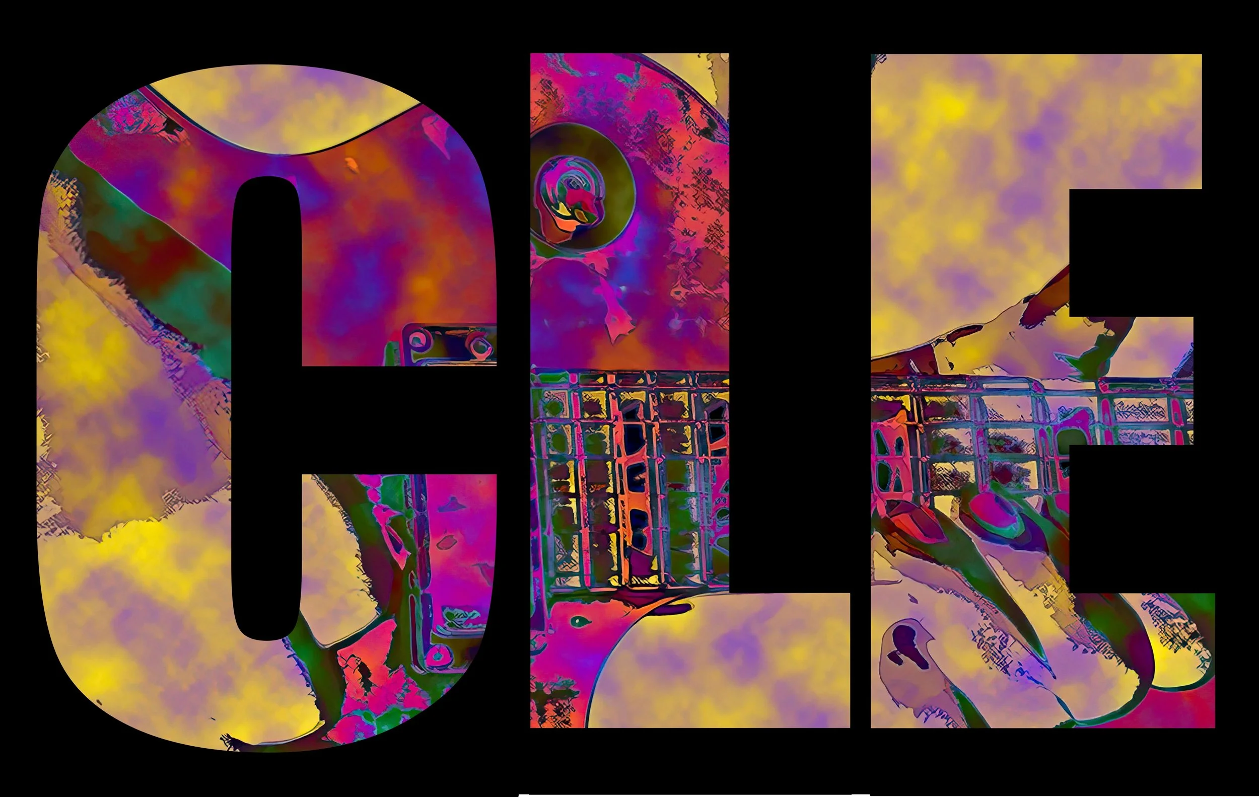
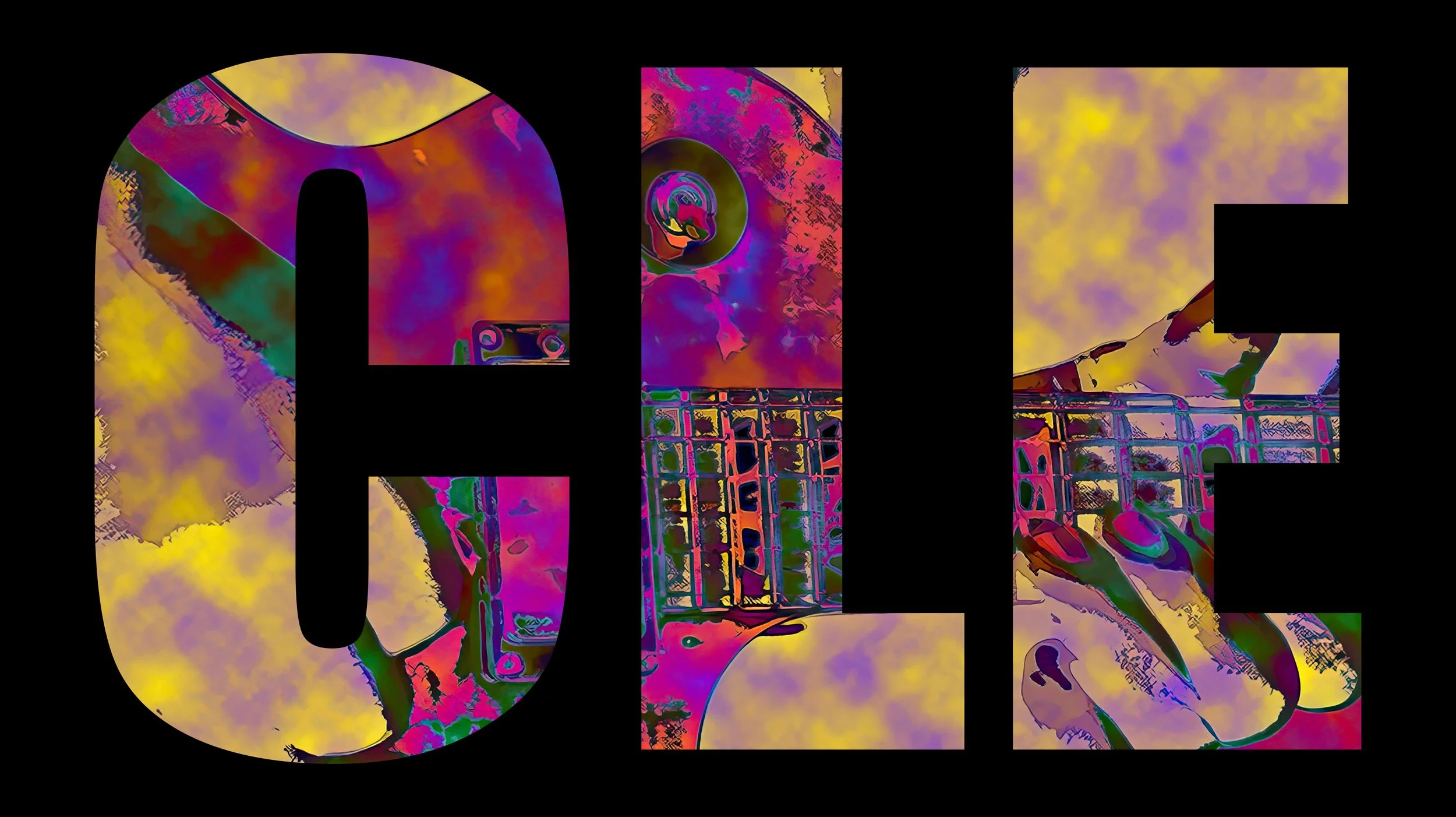
CLE
Closing the Gap: Letting the Image Breathe Through the Letters
Sometimes the work tells you what’s wrong—you just have to sit with it long enough to hear it.
I had been looking at this CLE piece for a couple of weeks. Not actively working on it. Just seeing it. Letting it exist in the room, on the screen, in passing moments. It wasn’t bad. In fact, it worked. But something about it felt held back—like it hadn’t fully committed to what it wanted to be.
At first glance, the structure made sense. Three bold letters. Strong presence. Clean separation. Each letter containing its own fragment of the image. It was clear, readable, and safe.
That was the problem.
The letters were doing too much of the talking.
The image—the actual substance of the piece—was being confined, almost politely, inside each character. It existed, but it didn’t flow. Each letter became its own compartment, and the eye would reset as it moved from C to L to E. Instead of reading as one unified visual statement, it read as three separate moments placed next to each other.
So I left it alone.
And after a couple of weeks of just looking at it, the adjustment became obvious.
I brought the letters closer together.
Then I enlarged them.
That was it. No new elements. No added effects. Just a shift in spacing and scale.
But that small move changed the entire structure of the piece.
By tightening the spacing, the image began to move across the letters instead of stopping inside them. The divisions didn’t disappear, but they softened. The composition started to read as a continuous field rather than three isolated containers.
By enlarging the letters, I reduced their dominance. They stopped being the subject and started acting as a framework—almost like cutouts or windows—allowing the image to come forward.
The letters still define the piece. It still says CLE. But now the meaning isn’t carried by the typography alone. The visual content inside the letters has room to speak, to connect, to exist as a whole.
That’s where the piece finally aligned with what I’ve been exploring—this idea of referential abstraction. The letters remain recognizable. The object—the guitar—remains present. But the composition is no longer about labeling something. It’s about revealing it through structure.
Nothing about the original version was wrong.
It just wasn’t finished.
Sometimes the most important part of the process isn’t adding more—it’s stepping back long enough to see what needs to be removed, reduced, or realigned.
This adjustment didn’t make the piece louder.
It made it more honest.