
Two Forces in the Void: Rockstar 7: Bam! and Chasing the Setting Sound (Float)
These two works exist inside the same language, yet they speak in completely different tones.
Both Rockstar 7: Bam! and Chasing the Setting Sound (Float) are built on my ongoing discipline of black — not as background, but as structure. Black is not the absence of image. It is the governing space that defines what is allowed to exist.
But what separates these two pieces is how the image behaves inside that void.
Chasing the Setting Sound (Float) — Emergence
In Chasing the Setting Sound (Float), the form feels discovered rather than declared. The image appears to be carried by the black, as if the void itself has allowed something to surface.
The edges are quiet.
The motion is continuous.
The energy flows without interruption.
This piece is about presence without force. It does not compete with the black — it respects it. The void remains dominant, and the form exists only by permission of that space. The result is meditative: a floating moment suspended in silence.
If there is a philosophy here, it is this:
The image does not claim space. It inhabits it.
Rockstar 7: Bam! — Impact
Rockstar 7: Bam! does the opposite.
Where Chasing the Setting Sound emerges, Bam! collides.
The motion is compressed.
The energy is concentrated.
Color does not drift — it strikes.
Here, the image no longer waits for space to accept it. It pushes outward, testing how much of the void it can occupy without breaking the discipline of black. The form still floats. The edges are still controlled. The black remains pure. But the relationship has shifted from harmony to tension.
This piece asks a different question:
How much energy can exist before the void must push back?
Same Language, Different Forces
What unites these two works is the same underlying architecture:
• Both reject the square as a governing container
• Both rely on pure black as a structural element
• Both treat form as something that must earn its presence
But their emotional physics are different.
Chasing the Setting Sound (Float) is continuous.
Rockstar 7: Bam! is punctuated.
One breathes.
The other strikes.
One suggests motion through time.
The other captures a moment of impact.
Why They Belong Together
Placed side by side, these pieces define the two poles of my current work:
• Emergence vs. Impact
• Permission vs. Assertion
• Silence vs. Compression
Neither is decorative. Neither uses black as negative space. In both, the void is active — shaping what exists by how much it refuses to yield.
If Chasing the Setting Sound (Float) is about how little can exist and still feel complete, then Rockstar 7: Bam! is about how much can exist before structure must assert itself.
They are not opposites.
They are the same philosophy under different pressure.
And that tension — between form that floats and form that collides — is where this body of work now lives.
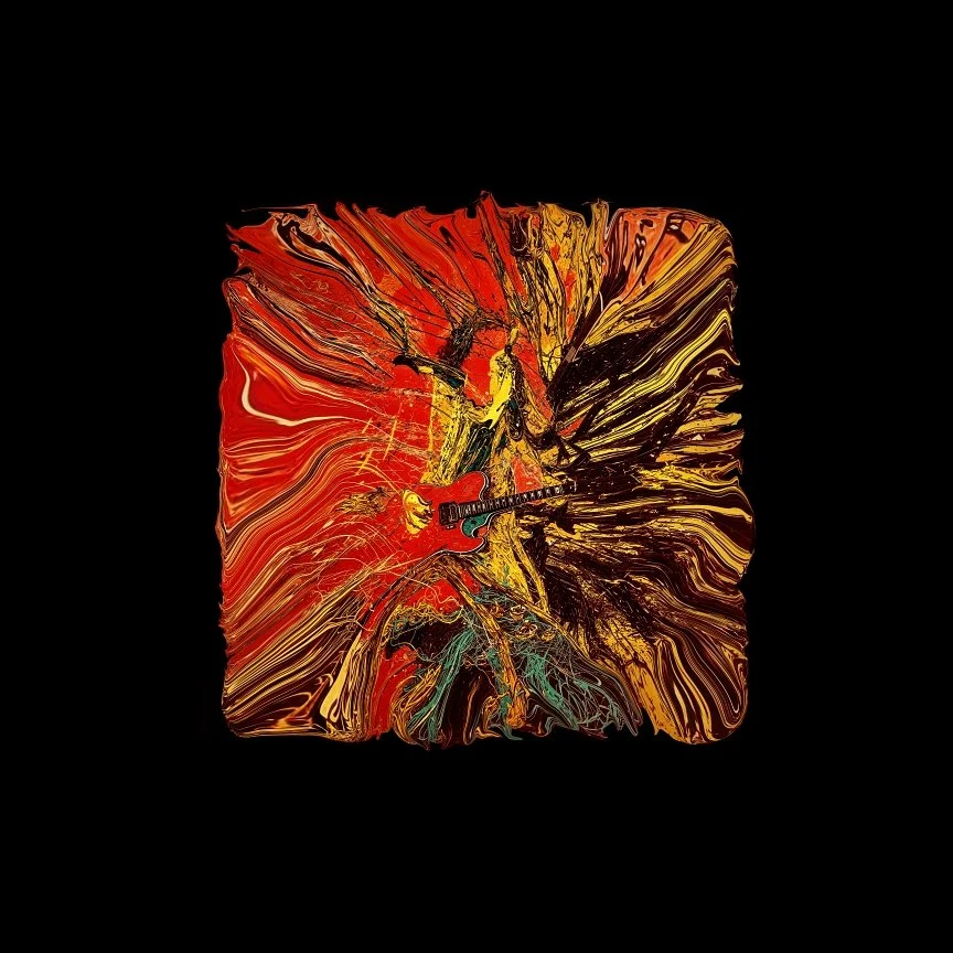
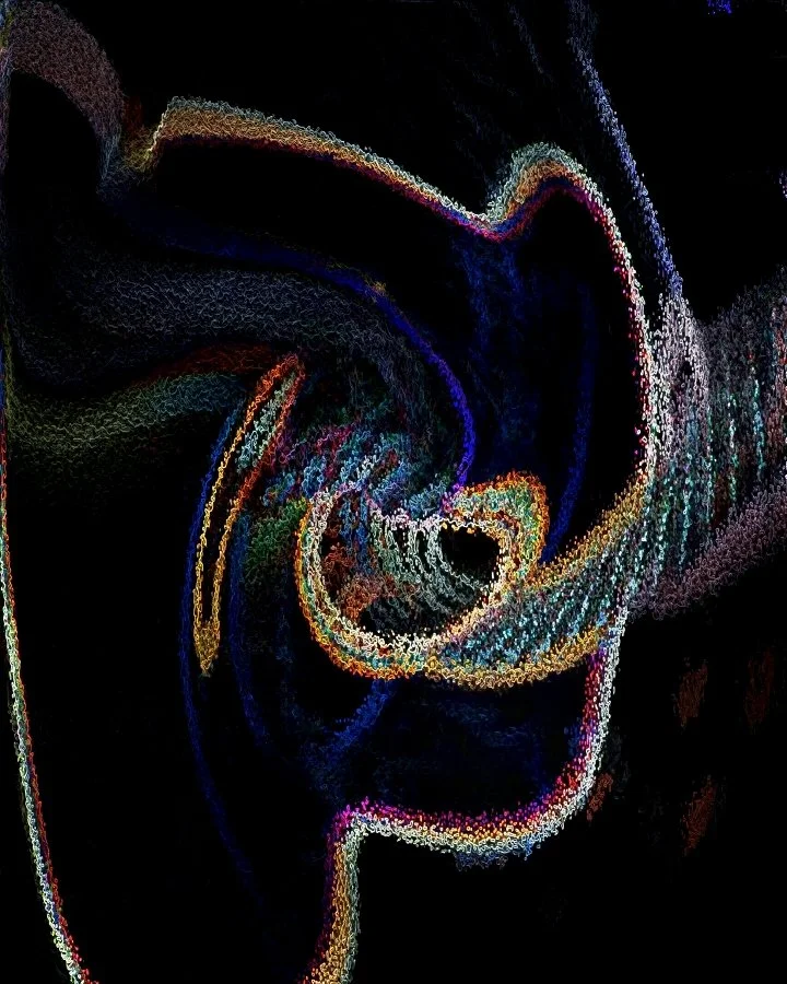
Rockstar 7: Bam! — When Form Breaks Free

Rockstar 7 Bam!
This piece didn’t begin as an image. It began as pressure.
I wasn’t trying to make something pretty. I was trying to answer a question that keeps surfacing in my work:
What happens when the square is no longer in charge?
Rockstar 7: Bam! is built on the idea that the object — the guitar, the musician, the energy — doesn’t need a rigid frame to exist. Instead of containing the form, I let it erupt outward. Motion replaces borders. Flow replaces geometry.
This is not realism. And it isn’t abstraction for abstraction’s sake either.
It is what I’ve come to call referential abstraction: the image is always anchored to a real object — a guitar, a body, a moment — but what you are actually seeing is its emotional and physical force, stripped of containment.
The black surrounding the piece is not background. It is structure.
It is discipline. It is the void that allows form to speak.
I have a deep affinity for pure black — not “almost black,” not textured darkness, not atmospheric gray. I mean true black. Absolute negative space. When everything extraneous disappears, the image either holds on its own… or it doesn’t deserve to exist.
In Rockstar 7: Bam!, the figure doesn’t sit inside the black.
It confronts it.
The color isn’t decoration. It’s impact. The motion isn’t a filter. It’s the residue of sound, movement, and presence. This isn’t a guitar being shown — it’s a guitar being felt.
This is where my work is going.
Away from frames.
Away from squares.
Toward images that stand in space on their own terms.
Not floating for effect —
but existing because they don’t need permission from the edges anymore.
Bill’s Black — Why the Space Matters as Much as the Form
Rockstar 7 Bam!
For most of my life, I’ve been obsessed with what surrounds the subject as much as the subject itself. That instinct didn’t start in art. It started years ago when I was in the paint business.
Customers would come in asking for “black.” Not charcoal. Not soft black. Not warm black. Just black. But anyone who’s ever worked with color formulas knows the truth: most blacks aren’t truly black at all. They’re mixtures. They carry undertones—blue, brown, red—that soften the depth. They behave politely. They behave safely.
I wanted something different.
So I began making my own: a gallon of clear base, loaded with eight ounces of black colorant. No compromises. No undertones. Just density. The blackest black I could physically create. We called it Bill’s Black, and it did exactly what I wanted it to do—it erased distraction and let everything placed against it speak with absolute clarity.
I didn’t realize it then, but that instinct never left me.
Today, in my artwork, I find myself returning to the same idea: black not as background, but as space. Not decoration. Not framing. Space. The place where form either survives on its own strength or disappears.
In my current body of work—what I’ve come to call Without Square—the image is no longer confined by tidy edges or polite borders. The subject floats. It breathes. The black is not there to “fill in.” It is there to remove everything that isn’t essential. What remains is presence.
This is where my idea of referential abstraction lives. My work always refers back to something real—a guitar, a player, a gesture, a moment in sound. But instead of illustrating that object, I reduce it to energy, movement, and structure. The black field becomes the silent stage on which that form exists. The object is not framed. It is revealed.
Just as in paint, pure black allows no excuses. If the edges are sloppy, you see it. If the composition is weak, you feel it. There is nowhere to hide. The form either holds its own, or it doesn’t.
That is what I’m after.
The black around these pieces is not absence. It is discipline. It is honesty. It is the same instinct that once drove me to mix a color so dark it absorbed everything else in the room. The space matters because it tells the truth about the object inside it.
This is not about making images that decorate walls. It’s about creating forms that exist—forms that stand in silence and still carry sound, motion, and meaning.
The square is gone.
The frame is gone.
What remains is the work—and the black that lets it speak.
The Medium Is Not Neutral: Why Art Presentation Is Philosophy
For most artists, presentation is an afterthought. A frame. A mat. A surface choice. Something solved at the end.
But when the work itself is built on reduction, structure, and conceptual restraint, presentation is not cosmetic. It is philosophical.
The way an artwork exists in space is not separate from what the artwork means.
When the Surface Becomes the Message
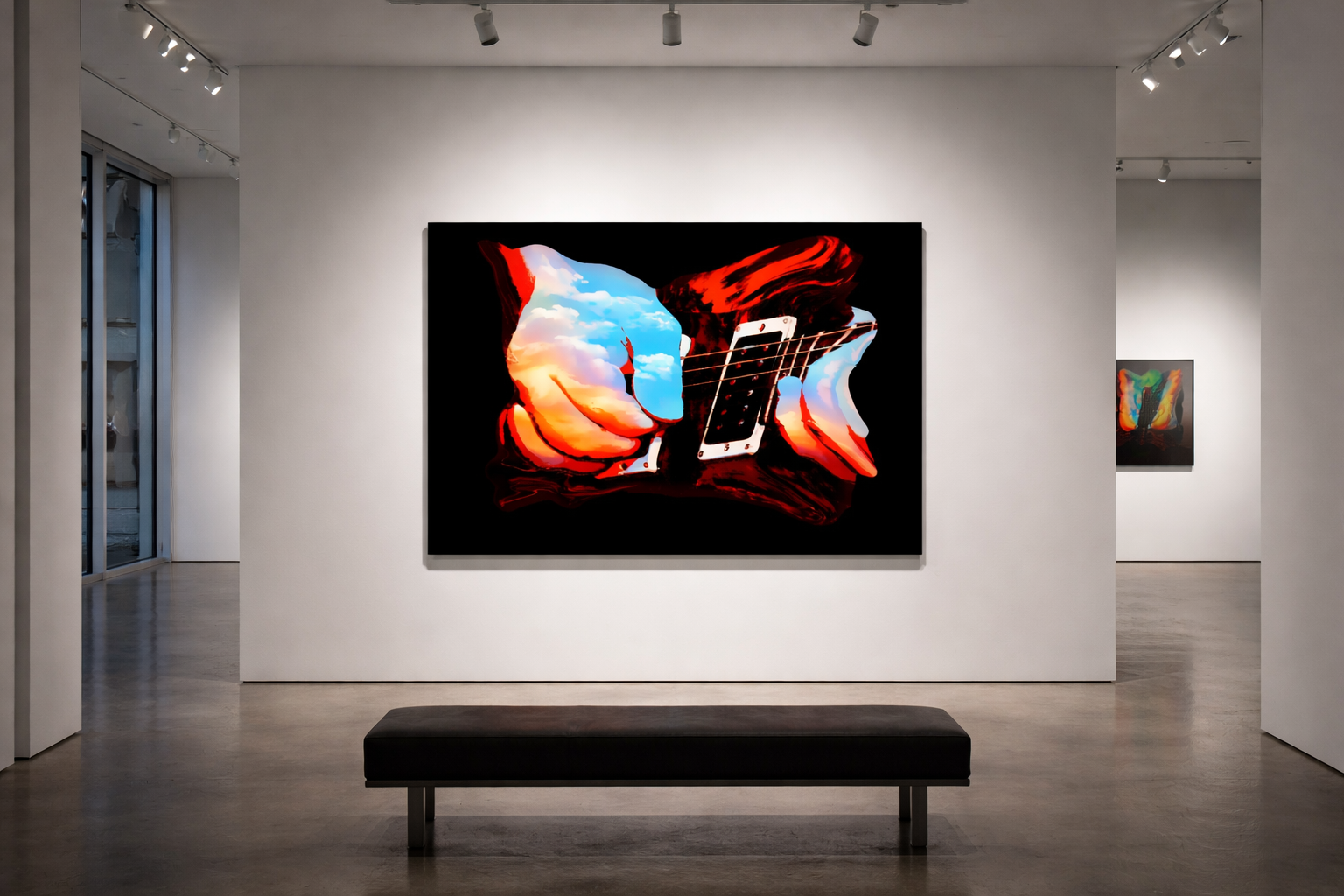
Paper has a long tradition in fine art. Giclée prints on cotton rag are beautiful, archival, and respected. But paper is fragile. And fragility demands protection.
Protection means glass.
The moment glass enters the equation, the work changes:
• Light reflects.
• The black becomes surface instead of void.
• The viewer sees themselves in the work.
• The image becomes something “behind” something else.
What was meant to be spatial becomes contained.
For art that depends on negative space not as background but as structure, glass is not neutral. It introduces shine. It introduces distance. It re-asserts the rectangle. The square comes back.
At that point, the work is no longer an object in space. It is an image inside a system.
And that system is not what my work is about.
When an Image Becomes an Object
My recent work has moved toward what I call referential abstraction: images anchored in real objects, but stripped of environment, context, and decorative detail. They are not depictions. They are constructed forms.
The black is not background. It is space.
The edges are not borders. They are boundaries of form.
This kind of work does not want to be looked at through something. It wants to be encountered.
That distinction matters.
Why Aluminum Changes Everything
When printed directly on aluminum using archival UV pigment inks (not glossy dye-sublimation), something fundamental shifts:
• There is no glass.
• There is no frame.
• There is no reflective plane between viewer and work.
• The black remains absolute.
• The edge becomes physical.
• The piece casts a shadow and occupies space.
The artwork is no longer an image in a container.
It becomes an object in the room.
This is not a production choice. It is an ontological one.
Paper says: I am an image that must be protected.
Glass says: I must be separated from the world to exist.
Aluminum says: I exist as I am.
That is the difference between decoration and structure.
Gloss Is Not Innocent
A common mistake is to assume that richness comes from shine.
For my work, gloss is not enhancement—it is interference.
Reflection turns space into surface.
Surface collapses void.
Void is the architecture of the piece.
If the black reflects a window, a gallery light, or a passing body, the work is no longer holding space. It is reacting to the environment.
Restraint is not absence. It is authority.
And authority does not shimmer.
Without Square Is Not a Style Choice
The idea of Without Square is not simply removing a border. It is the refusal of containment as a governing principle.
Not “how can I make the image look like it floats?”
But: “What is this object allowed to be?”
If the format reintroduces enclosure, reflection, or decorative surface, the philosophy breaks—even if the image itself is unchanged.
This is why certain materials feel wrong even when they look “better.” They add. They embellish. They soften. They turn structure into surface.
My work is not asking to be enriched.
It is asking to remain precise.
Presentation Is Meaning
Every decision—paper, glass, acrylic, aluminum—is a statement about what the work is.
Is it:
• an image to be viewed?
• a surface to be admired?
• or an object to be encountered?
My work is not trying to be beautiful in the traditional sense. It is trying to be clear.
Clear in form.
Clear in edge.
Clear in space.
Clear in intent.
Which means the medium cannot be decorative. It must be structural.
The Conclusion
Art is not finished when the image is done.
It is finished when its physical existence aligns with its philosophy.
For this body of work, that means:
• No glass
• No frames
• No gloss
• No reflective surfaces
• No reintroduced square
• Black as absolute space
• The edge as form, not border
Because in the end, the medium is not just how the art is shown.
The medium is what the art is allowed to be.
Evolution
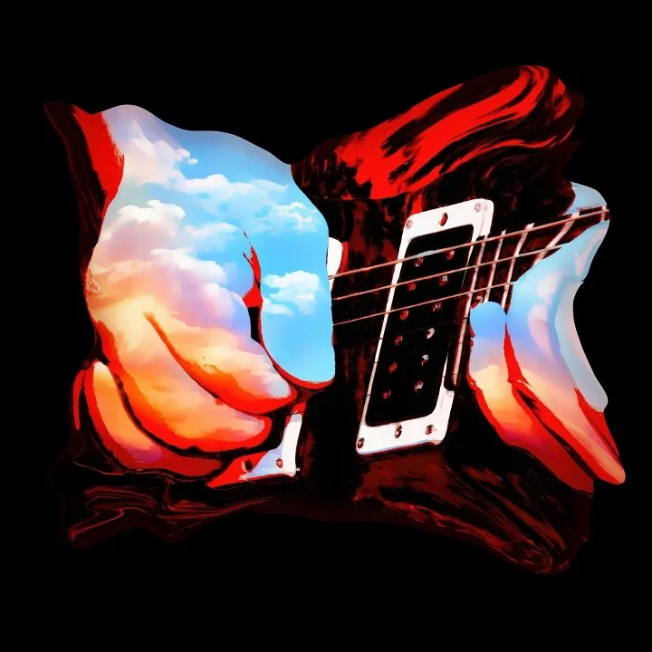
I started with a piece of art that I created the other day. I kept looking at it with great pleasure. It is called “Chasing the Setting Sound.”
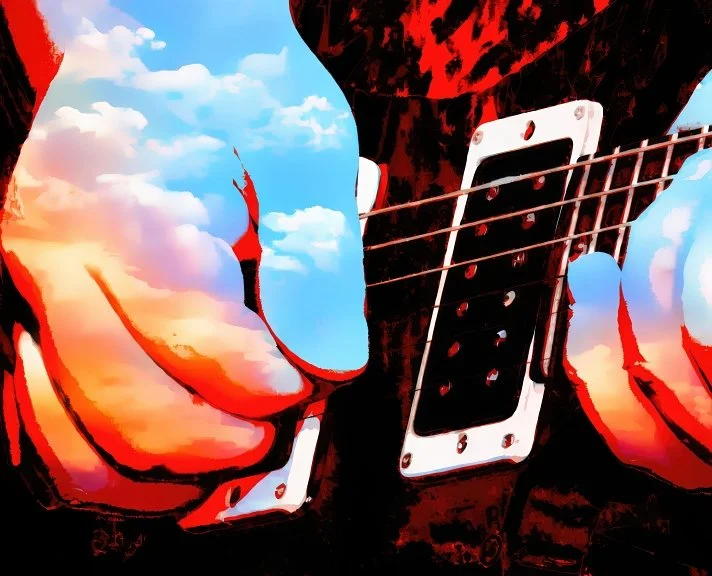
Chasing the Setting Sound
From a T-Shirt to Unbound Energy
I didn’t begin this as “fine art.”
I began it the way a lot of visual ideas begin in real life —
thinking like a T-shirt design.
A strong image.
Immediate impact.
Something that could live on the body, move through the world, and be understood without explanation.
That instinct comes from growing up with album covers, posters, and shirts that carried meaning without asking permission. Images that were bold, emotional, and lived with you — not hung behind glass.
That was the first form.
Wearable image.
Stage One: The Wearable Image
The early image was direct:
a hand on a guitar, energy visible, color doing the work emotion usually does.
It wasn’t meant to be polite or restrained.
It was meant to hit — the way music hits before you think about it.
At this stage, the image was doing exactly what a shirt or an album cover does best:
communicating fast, emotionally, and honestly.
But something about the shape still felt contained.

Floating Form.
Stage Three: Floating in Black
In black space, the image changed again.
Without a frame, without context, without utility, the piece became quieter — but more intense. The color and motion had nowhere to escape to. They had to hold their own.
This version felt closest to how music exists:
invisible, immersive, and uncontained.
But something was still missing.
Not explanation — recognition

Declared Presence.
Stage Four: Returning With Language
The final shift was unexpected, but inevitable.
The piece returned to its origin —
the album cover, the T-shirt, the declarative statement —
but this time with everything it had learned along the way.
The words UNBOUND ENERGY didn’t describe the image.
They completed it.
The type breaks the way sound breaks.
It doesn’t sit politely under the image — it fractures, carries force, and absorbs impact.
This became the third form of the work:
not just image,
not just object,
but image plus declaration.
What I Realized Along the Way
This process helped me recognize something important about my work.
I’m not interested in choosing between beauty and meaning.
I’m interested in proving they belong together.
The visual language of T-shirts and album covers taught my generation how to see. That language is fast, emotional, and beautiful — and it’s capable of carrying real weight.
This piece traces that path:
from wearable image,
to floating form,
to declared presence.
It isn’t an ending.
It’s a recognition of where I stand — and where the work wants to go next.
—
UNBOUND ENERGY
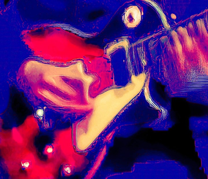
From Sound to Color: Where Chasing the Setting Sound Began

This photograph captures the real moment that became Chasing the Setting Sound.
It’s a live performance — a guitarist mid-phrase, mid-emotion — frozen in black and white. At the time, it wasn’t meant to be anything more than documentation. But over time, certain images begin to carry more than what they show. They hold direction.
The sound was already there.
What followed was letting the image dissolve.
Rather than illustrating the photograph, I allowed it to release its visual gravity — the physical details loosening, the sound becoming color, motion becoming atmosphere. The original image didn’t disappear; it stayed present as a referent, an anchor. What changed was the way the moment was allowed to exist.
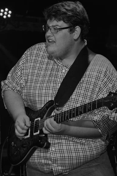
This is the same moment, translated.
The black-and-white origin matters. It strips the scene down to structure, weight, and gesture — the raw data of the experience. Color enters later, not as decoration, but as resonance. The sound spreads outward, no longer bound to the room or the instrument, but to the emotional arc of the performance itself.
This is part of my method.
I’m not abstracting away from reality — I’m abstracting through it. Each piece begins with something specific and lived, then moves toward a visual language that reflects how sound, memory, and presence actually behave over time.
Chasing the Setting Sound exists in both places at once:
the documented moment, and the space it echoes into.
Abstraction

This work exists in referential abstraction.
The guitar is not illustrated or reproduced — it is invoked.
What remains is surface, gesture, pressure, and residue.
The image carries the memory of sound rather than its depiction.
Edges dissolve the way notes do when they leave the room.
What you’re seeing isn’t an object; it’s a trace of touch and rhythm.
I’m less interested in what a guitar looks like than in what it leaves behind —
the afterimage of vibration, the quiet weight of use,
and the emotional space sound occupies once the instrument is gone.
Melt 5 — Referential Abstraction and the Guitar Remembered
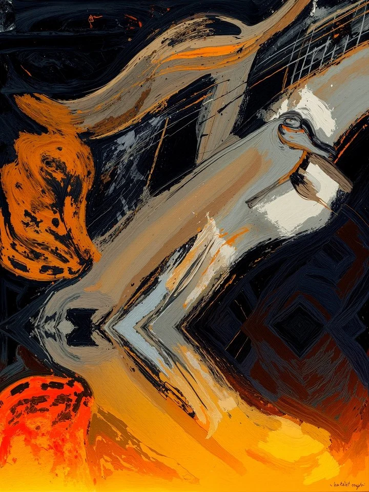
Melt 5 marks a turning point in my work.
For years, the guitar in my art was something you could clearly see — a form, an object, a recognizable instrument tied to music, place, and memory. With Melt 5, that certainty begins to dissolve. The guitar is no longer illustrated. It is remembered.
This is what I’ve come to understand as referential abstraction.
The image does not abandon the guitar. Instead, it lets go of description and holds onto essence. The curves, tension, compression, and energy remain, but the object itself begins to blur — much like memory does over time. What’s left is not a picture of a guitar, but the residue of sound, touch, and experience that the guitar carries.
The surface of Melt 5 feels unstable by design. Forms appear to stretch, soften, and break apart. Edges dissolve. What once held structure now feels as if it’s been exposed to heat — emotional or sonic — and allowed to deform. This “melting” is not destruction; it’s transformation.
At the center of the work is what I call the guitar glosso — the accumulated visual language of the guitar: curves learned by the hand, reflections burned into memory, the weight of the instrument resting against the body. Even when the guitar is no longer clearly visible, the glosso persists. The viewer senses it before recognizing it.
This is important to me.
I’m not interested in abstraction as decoration, nor realism as documentation. I’m interested in the space between recognition and feeling — that moment when something registers emotionally before the mind assigns it a name. Melt 5lives in that space.
Some viewers recognize the guitar immediately. Others don’t see it at all — at least not at first. Both responses are valid. In fact, that tension is part of the work. The painting asks the viewer to sit with uncertainty, to feel before identifying.
In that way, Melt 5 is less about guitars and more about how music exists inside us — distorted by memory, shaped by time, and charged with emotion long after the sound itself is gone.
This piece isn’t an ending. It’s a doorway.
— Bill Sanders
Cleveland Guitar Prints
Groove 8 — Studio Journal
Some pieces start with an image.
Groove 8 started with a feeling — the moment when rhythm locks in and stops being counted and starts being felt.
This piece isn’t about a guitar you can see or a player you can identify. It’s about the energy a guitar releases once it’s played — the bends, the sustain, the vibration that hangs in the air after the strings stop moving. That invisible moment where sound continues even after the hands have paused.
In Groove 8, light becomes motion and motion becomes rhythm. The lines arc and fold the way music does when it’s alive — not rigid, not measured, but responsive. Color behaves like tone, shifting and swelling as if it’s reacting to what came before it. The dark space isn’t empty. It’s the silence that makes the groove possible.
Music has always lived in that space between control and release. You can practice scales, count time, and plan arrangements — but when a groove truly locks in, something else takes over. Groove 8 is an attempt to capture that exact transition: when repetition becomes momentum, and momentum becomes feeling.
When this piece was shared on Facebook, the response was immediate and unexpected. Thousands of likes and reactions came in, along with comments from musicians and non-musicians alike who felt something familiar in it. Some saw motion. Some saw sound. Some described it as something they recognized rather than something they could explain. That reaction mattered, because it confirmed what the piece was trying to do — translate music into something visual and emotional without forcing interpretation.
Abstraction fits music because music itself is abstract. You can’t hold it, frame it, or stop it mid-moment. You experience it as it moves through you. Groove 8 doesn’t tell you what to hear or how to feel. It leaves room for personal memory — a late-night jam, a riff that went longer than expected, a moment when everyone in the room felt the same pulse at once.
Like all Cleveland Guitar Prints works, Groove 8 is created as affordable art meant to live in real spaces. It’s not designed to feel distant or precious. It belongs in music rooms, studios, listening spaces, and homes where sound and creativity are part of everyday life. It doesn’t shout or demand attention — it hums quietly until you notice it.
Some pieces describe something.
Others resonate.
Bill Sanders
Ray 10 — Studio Journal
Ray 10
There are moments when an instrument stops being an object and starts behaving like energy.
Ray 10 came from that space.
This piece isn’t about representing a guitar in a literal way. It’s about what happens inside the sound—where vibration bends form, where color replaces edges, and where music becomes physical. I wasn’t chasing clarity. I was interested in pressure, movement, and release.
The red and blue fields push against each other like opposing forces. Lighter tones act as conduits—paths where energy escapes. What’s left is not a clean image, but a trace. A residue. Almost like sound leaving a mark after it has already passed.
I’ve been moving away from depiction and toward experience. Ray 10 lives in that shift. It sits somewhere between instrument and body, memory and motion. It’s closer to how music feels than how it looks.
The title is intentionally restrained. Ray 10 suggests a frequency, a transmission, or a measured signal rather than an explanation. That tension feels honest to the work.
This piece marks another step in a new visual language I’m developing—one where abstraction carries weight, texture carries emotion, and sound is allowed to distort the image instead of the other way around.
— Bill Sanders